CSSʵ��stickt footer��ʾ����������Щ��
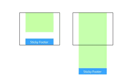
��ν “Sticky Footer”��������ʲô�µ�ǰ�˸���ͼ�������ָ�ľ���һ����ҳЧ�������ҳ�����ݲ��㹻��ʱ��ҳ�Ź̶�����������ڵĵײ�����������㹻��ʱ��ҳ�Ź̶���ҳ�����ײ����������ҳ���ݲ��������õ�ҳ�žͻᱣ������������ڵײ���
ʵ��
����
1. �����ݲ��ֵĵײ���߾���Ϊ����
���Ǹ��Ƚ��������÷��������ݲ�����С�߶���Ϊ100%�����������ݲ��ֵĸ��ײ���߾�ֵ���ﵽ���߶Ȳ���ʱ��ҳ�ű����ڴ��ڵײ������߶ȳ�������֮�Ƴ���Ч����
<body>
<div class="wrapper">
content
<div class="push"></div>
</div>
<footer class="footer"></footer>
</body>html, body {
height: 100%;
margin: 0;
}
.wrapper {
min-height: 100%;
/* ����footer�ĸ߶� */
margin-bottom: -50px;
}
.footer,
.push {
height: 50px;
}
���������Ҫ�������ж����ռλԪ�أ���.push��
��Ҫע�����.wrapper��margin-bottomֵ��Ҫ��.footer�ĸ���heightֵ����һ�£���һ�㲻̫�Ѻá�
2. ��ҳ�ŵĶ�����߾���Ϊ����
��Ȼ����������ʹ�ø���margin bottom�����ܷ�ʹ�ø�margin top�𣿵�Ȼ���ԡ�
�����������Ӹ�Ԫ�أ��������ݲ��ֵĵײ��ڱ߾���ҳ�Ÿ߶ȵ�ֵ��ȡ�
<body>
 <div class="content">
  <div class="content-inside">
   content
  </div>
 </div>
 <footer class="footer"></footer>
</body>html, body {
 height: 100%;
 margin: 0;
}
.content {
 min-height: 100%;
}
.content-inside {
 padding: 20px;
 padding-bottom: 50px;
}
.footer {
 height: 50px;
 margin-top: -50px;
}
�������ַ�������һ��һ��������Ҫ�������Ӳ���Ҫ��htmlԪ�ء�
3. ʹ��flexbox���Ժв���
�������ַ�����footer�߶ȶ��ǹ̶��ģ�ͨ����˵�ⲻ������ҳ���֣����ݻ�ı䣬���Ƕ��ǵ��Եģ�һ�����ݳ����̶��߶Ⱦͻ��ƻ����֡����Ը�footerʹ��flexbox�ɣ������ĸ߶ȿ��Ա���С��Ư��~���R∇�Q��
<body>
 <div class="content">
  content
 </div>
 <footer class="footer"></footer>
</body>html {
 height: 100%;
}
body {
 min-height: 100%;
 display: flex;
 flex-direction: column;
}
.content {
 flex: 1;
}
�㻹��������������header�����������Ӹ���Ԫ�ء��ɴ����¼���ѡ����һ��
- flex: 1 ʹ���ݣ��磺.content���߶ȿ�����������
- margin-top: auto
���ס�������С�Flexbox����ָ�ϣ�Ӣ�� ���ء�
4. absolute
ͨ�����Զ�λ����Ӧ���dz����ķ�����ֻҪʹ��ҳ��һֱ��λ��������Ԥ��ռλλ�á�
<div class="wrapper">
<div class="content"><!-- ҳ�������������� --></div>
<div class="footer"><!-- ��Ҫ���� Sticky Footer Ч����ҳ�� --></div>
</div>html, body {
height: 100%;
}
.wrapper {
position: relative;
min-height: 100%;
padding-bottom: 50px;
box-sizing: border-box;
}
.footer {
position: absolute;
bottom: 0;
height: 50px;
}
���������ָ�� html��body 100% �ĸ߶ȣ��� content �� padding-bottom ��Ҫ�� footer �� height һ�¡�
5. calc
ͨ�����㺯�� calc ���㣨�Ӵ��߶� - ҳ�Ÿ߶ȣ�������������С�߶ȣ�����Ҫ�κζ�����ʽ���������������١����
<div class="wrapper">
<div class="content"><!-- ҳ�������������� --></div>
<div class="footer"><!-- ��Ҫ���� Sticky Footer Ч����ҳ�� --></div>
</div>.content {
min-height: calc(100vh - 50px);
}
.footer {
height: 50px;
}
������迼�� calc() �Լ� vh ��λ�ļ�����������Ǹ��������ʵ�ַ�����ͬ���������� footer �ĸ߶�ֵ��Ҫ�� content ���еļ���ֵһ�¡�
6. table
ͨ�� table ����ʹ��ҳ���Ա������̬���֡�
<div class="wrapper">
<div class="content"><!-- ҳ�������������� --></div>
<div class="footer"><!-- ��Ҫ���� Sticky Footer Ч����ҳ�� --></div>
</div>html, body {
height: 100%;
}
.wrapper {
display: table;
width: 100%;
min-height: 100%;
}
.content {
display: table-row;
height: 100%;
}
��Ҫע����ǣ�ʹ�� table ��������һ���Ƚϳ�������ʽ���ƣ�ͨ�� margin��padding��border �����Ի����Ԥ�ڡ����߲�����ʹ�������������Ȼ������Ҳ�ǿ��Խ���ģ����������ʽд�� table �ϡ�
7. ʹ��Grid����
grid��flexbox��Ҫ�ºܶ࣬���Ҹ��Ѻܼ�࣬����ͬ���С�Grid����ָ�ϣ�Ӣ�� �����ϡ�
<body>
 <div class="content">
  content
 </div>
 <footer class="footer"></footer>
</body>html {
 height: 100%;
}
body {
 min-height: 100%;
 display: grid;
 grid-template-rows: 1fr auto;
}
.footer {
 grid-row-start: 2;
 grid-row-end: 3;
}
�ź����ǣ����֣�Grid layout��Ŀǰ��֧��Chrome Canary��Firefox Developer Edition�汾��
�ܽ�
���ϼ���ʵ�ַ��������߶�����Ŀ�г��Թ���ÿ��ʵ�ֵķ�����ʵ��ͬС�죬ͬʱҲ�����Լ������ס������еķ����������������⣬��Ҫ�̶�ҳ�Ÿ߶ȣ������еķ�����Ҫ���Ӷ����Ԫ�ػ�����Ҫ Hack �ֶΡ�ͬѧ�ǿ��Ը���ҳ���������ѡ�����ʺϵķ�����
��Ȼ�������Dz��ϸ��µģ�Ҳ�����кܶͬ�ġ����õķ����������Ŵ������Ŀ����һ���ģ�Ϊ�˸��õ��û����飡
���Ͼ��DZ��ĵ�ȫ�����ݣ�ϣ���Դ�ҵ�ѧϰ����������Ҳϣ����Ҷ��֧��·����
���ĵ�ַ��http://www.45fan.com/dnjc/97296.html