怎么样使用HTMl实现移动端固定悬浮半透明搜索框?
Question. 问题
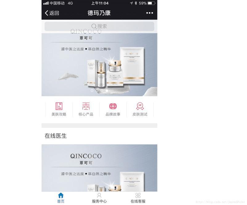
在移动端商城系统中,我们常常看到位于页面顶部有一个搜索框,这类搜索框博主比较喜欢的是固定在页面顶部,半透明悬浮,能依稀看见部分轮播图的形式。
要制作这样的搜索框,技术关键在于:
- fixed 搜索框定位
- opacity 设置透明度
Solution. 解决
首先我们定义一个 html 片段:
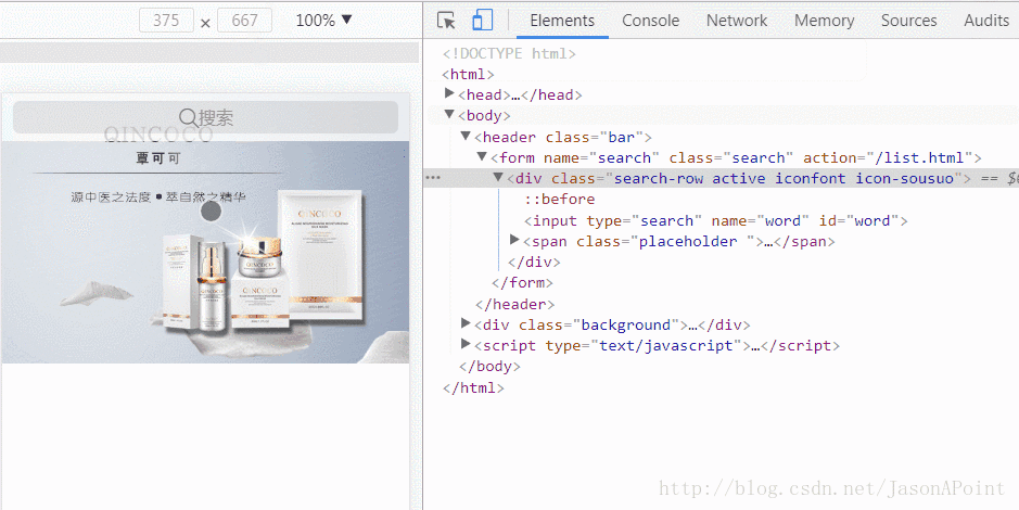
<!-- 搜索框 -->
<header class="bar">
 <form name="search" class="search" id="search" action="">
  <div class="search-row">
   <input type="search" name="word" id="word">
   <span class="placeholder "><span class="iconfont icon-sousuo"></span><span class="text">搜索</span></span>
  </div>
 </form>
</header>
<!-- 一个背景图 实际上这里往往是轮播图 -->
<div class="background">
 <img src="bg.jpg">
</div>
header 标签为搜索框,下面的 div 为一个背景图。
同时附上 CSS 样式:
<style type="text/css">
body {
 margin: 0; padding: 0;
 font-size: 14px; font-family: "microsoft yahei",'Arial', 'Verdana','Helvetica', sans-serif;
}
.bar {
 position: fixed; top: 0; left: 0; right: 0; /* 决定了搜索框置顶 */
 height: 44px; padding: 0 10px;
 background-color: #fff; opacity: 0.8; /* 搜索框半透明效果 */
 z-index: 10;
}
.bar form {
 display: block; padding: 0;margin: 0;
}
.search-row {
 position: relative;
 height: 30px; padding: 7px 0;
}
.search-row input[type=search] {
 position: absolute; top: 7px;
 height: 30px; line-height: 21px; width: 100%; padding: 10px 15px 10px 30px;
 border: 0; border-radius: 6px; outline: 0; background-color: rgba(0,0,0,0.1);
 font-size: 16px; text-align: center;
 z-index: 100;
}
.search-row .placeholder {
 position: absolute; top: 2px; left: 0; right: 0;
 display: inline-block; height: 34px; line-height: 34px;
 border: 0; border-radius: 6px;
 font-size: 16px; text-align: center; color: #999;
 z-index: 1;
}
.search-row .placeholder .iconfont {
 display: inline-block; width: 19px; line-height: 24px; padding: 10px 0;
 font-size: 21px; color: #666;
}
.search-row .placeholder .text {
 line-height: 40px;
 vertical-align: top;
}
.background img {
 width: 100%;
}
.active:before {
 position: absolute; top: 11px; left: 5px; right: auto;
 display: block; margin-right: 0;
 font-size: 21px;
}
.active input[type=search] {
 text-align: left
}
.active .placeholder{
 display: none
}
</style>
很长的一段 CSS 样式,但是其核心就两句话position: fixed; /* 决定了搜索框置顶 */ 和 background-color: #fff; opacity: 0.8; /* 搜索框半透明效果 */,其他的样式均为了页面的排版,排版的细节需要各位读者自己写一遍理解,过程可能需要花费点时间。
这样我们就完成了一个静态的搜索框:

备注:这里的搜索图标使用了 iconfont,读者可自行到 iconfont矢量图标库 下载。
至此,我们还需要通过 JS 实现一些动效:
用于实现用户切换输入时「搜索」位置图标的切换,原理很简单,增加和移除 class 类,这些类定义了样式。
.active:before {
 position: absolute; top: 11px; left: 5px; right: auto;
 display: block; margin-right: 0;
 font-size: 21px;
}
.active input[type=search] {
 text-align: left
}
.active .placeholder{
 display: none
}
<script type="text/javascript">
/* 输入框获取到焦点 表示用户正在输入 */
$("#word").focusin(function() {
 $(".search-row").addClass("active iconfont icon-sousuo");
});
/* 输入框失去焦点 表示用户输入完毕 */
$("#word").focusout(function() {
 /* 判断用户是否有内容输入 */
 if ($(this).val()=="") {
  /* 没有内容输入 改变样式 */
  $(".search-row").removeClass("active iconfont icon-sousuo");
 } else {
  /* 有内容输入 保持样式 并提交表单 */
  $("#search").submit();
 }
});
</script>
备注:这里需要引入 jQuery,千万别忘了!
Extension. 扩展
完整 html 代码:
<!DOCTYPE html>
<html>
<head>
<title></title>
<meta name="viewport" content="width=device-width, initial-scale=1,maximum-scale=1,user-scalable=no">
<link rel="stylesheet" type="text/css" href="iconfont/iconfont.css">
<script type="text/javascript" src="jquery-1.11.1.min.js"></script>
<style type="text/css">
body {
 margin: 0; padding: 0;
 font-size: 14px; font-family: "microsoft yahei",'Arial', 'Verdana','Helvetica', sans-serif;
}
.bar {
 position: fixed; top: 0; left: 0; right: 0; /* 决定了搜索框置顶 */
 height: 44px; padding: 0 10px;
 background-color: #fff; opacity: 0.8; /* 搜索框半透明效果 */
 z-index: 10;
}
.bar form {
 display: block; padding: 0;margin: 0;
}
.search-row {
 position: relative;
 height: 30px; padding: 7px 0;
}
.search-row input[type=search] {
 position: absolute; top: 7px;
 height: 30px; line-height: 21px; width: 100%; padding: 10px 15px 10px 30px;
 border: 0; border-radius: 6px; outline: 0; background-color: rgba(0,0,0,0.1);
 font-size: 16px; text-align: center;
 z-index: 100;
}
.search-row .placeholder {
 position: absolute; top: 2px; left: 0; right: 0;
 display: inline-block; height: 34px; line-height: 34px;
 border: 0; border-radius: 6px;
 font-size: 16px; text-align: center; color: #999;
 z-index: 1;
}
.search-row .placeholder .iconfont {
 display: inline-block; width: 19px; line-height: 24px; padding: 10px 0;
 font-size: 21px; color: #666;
}
.search-row .placeholder .text {
 line-height: 40px;
 vertical-align: top;
}
.background img {
 width: 100%;
}
.active:before {
 position: absolute; top: 11px; left: 5px; right: auto;
 display: block; margin-right: 0;
 font-size: 21px;
}
.active input[type=search] {
 text-align: left
}
.active .placeholder{
 display: none
}
</style>
</head>
<body>
<!-- 搜索框 -->
<header class="bar">
 <form name="search" class="search" id="search" action="">
  <div class="search-row">
   <input type="search" name="word" id="word">
   <span class="placeholder "><span class="iconfont icon-sousuo"></span><span class="text">搜索</span></span>
  </div>
 </form>
</header>
<!-- 一个背景图 实际上这里往往是轮播图 -->
<div class="background">
 <img src="bg.jpg">
</div>
</body>
<script type="text/javascript">
/* 输入框获取到焦点 表示用户正在输入 */
$("#word").focusin(function() {
 $(".search-row").addClass("active iconfont icon-sousuo");
});
/* 输入框失去焦点 表示用户输入完毕 */
$("#word").focusout(function() {
 /* 判断用户是否有内容输入 */
 if ($(this).val()=="") {
  /* 没有内容输入 改变样式 */
  $(".search-row").removeClass("active iconfont icon-sousuo");
 } else {
  /* 有内容输入 保持样式 并提交表单 */
  $("#search").submit();
 }
});
</script>
</html>
总结
以上所述是小编给大家介绍的HTML实现移动端固定悬浮半透明搜索框,希望对大家有所帮助,如果大家有任何疑问请给我留言,小编会及时回复大家的。在此也非常感谢大家对路饭网站的支持!
本文地址:http://www.45fan.com/a/question/94976.html