css3的动画特效之动画序列分析
首先复习一下animation动画添加各种参数
(1)infinite参数,表示动画将无限循环。在速度曲线和播放次数之间还可以插入一个时间参数,用以设置动画延迟的时间。如希望使图标在1秒钟后再开始旋转,并旋转两次,代码如下
.close:hover::before{
  -webkit-animation: spin 1s linear 1s 2;
  animation: spin 1s linear 1s 2;
}
(2)alternate参数。animation动画中加入反向播放参数alternate。在加入该参数后,动画将在偶数次数时反向播放动画。
.close:hover::before{
  -webkit-animation: spin 1s linear 1s 2 alternate;
  animation: spin 1s linear 1s 2 alternate;
}
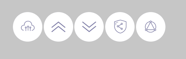
animation属性参数中,延迟参数是我们较为常用的一种参数。当动画的对象为多个时,我们常常用延迟参数来形成动画序列。如以下代码定义了5个不同的图标:
<span class="close icon-suningliujinyun">Close</span>
<span class="close icon-shousuo">Close</span>
<span class="close icon-zhankai">Close</span>
<span class="close icon-diaoyonglian">Close</span>
<span class="close icon-lingshouyun">Close</span>
图标的基本样式和之前的Close图标一致,不同之处在于此处的图标都设置为inline-block,使它们能够横向排列。代码如下:
.close{
  font-size:0px;/*使span中的文字不显示*/
  cursor:pointer;/*使鼠标指针显示为手型*/
  display:inline-block;
  width:100px;
  height:100px;
  line-height:100px;
  border-radius:50%;/*使背景形状显示为圆形*/
  background:#FFF;
  color:#8b8ab3;
  text-align:center;
}
.close::before{
  font-family: 'suningcloud';
  speak:none; /*使文本内容不能通过屏幕阅读器等辅助设备读取*/
  font-size:48px;
  display:block;
}
初始化的时候展示,如下图所示;
接下来,为图标添加animation动画,使图标初始位置向下偏移-100%,然后再向上移动回到初始位置,在此过程中同时使图标由完全透明变化为完全不透明
.close{
font-size:0px;/*使span中的文字不显示*/
cursor:pointer;/*使鼠标指针显示为手型*/
display:inline-block;
width:100px;
height:100px;
line-height:100px;
border-radius:50%;/*使背景形状显示为圆形*/
background:#FFF;
color:#8b8ab3;
text-align:center;
/**/
-webkit-animation: moving 1s linear;
animation: moving 1s linear;
}

@-webkit-keyframes moving {
  from {
    opacity: 0;
    -webkit-transform: translateY(100%);
  }
  to {
    opacity: 1;
    -webkit-transform: translateY(0%);
  }
}
@keyframes moving {
  from {
    opacity: 0;
    transform: translateY(100%);
  }
  to {
    opacity: 1;
    transform: translateY(0%);
  }
}
以上5个图标的动画效果都是同时进行的,为了使图标运动带有先后顺序,我们将为每个动画添加延迟。和之前运用的方法所不同,我们可以直接通过animation-delay属性来设置animation动画延迟,代码如下:
.icon-suningliujinyun{
-webkit-animation-delay:0s;
animation-delay: 0s;
}
.icon-shousuo{
-webkit-animation-delay:.1s;
animation-delay: .1s;
}
.icon-zhankai{
-webkit-animation-delay:.2s;
animation-delay: .2s;
}
.icon-diaoyonglian{
-webkit-animation-delay:.3s;
animation-delay: .3s;
}
.icon-lingshouyun{
-webkit-animation-delay:.4s;
animation-delay: .4s;
}
在以上代码中,我们设置了5个图标的延迟时间分别为0、0.1、0.2、0.3和0.4s。实际上,延迟0秒为默认值,因此第一个图标实际上也不需要设置延迟代码。测试页面,动画效果如图所示。
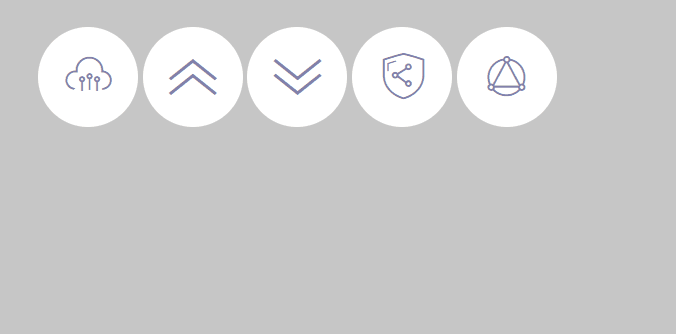
里面我刷新了两次,发现最开头,几个图标将在顶部一闪而过。这个算bug
造成这个bug原因:在于除第一个图标外,其余图标都有一定的动画延迟,而在动画没有开始时,图标是没有发生偏移,也是完全不透明的,只有当动画开始的那一瞬间,图标才会切换到完全透明且偏移的动画起始状态。
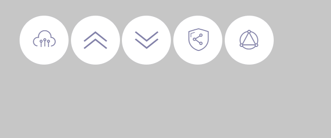
解决办法:需要使用animation动画的animation-fill-mode属性。这一属性规定了元素在动画时间之外的状态是怎样的。若该值为forwards,则表示动画完成后保留最后一个关键帧中的属性值,该值为backwards时则恰好相反,表示在动画延迟之前就使得元素应用第一个关键帧中的属性值,而该值为both时则表示同时包含forwards和backwards两种设置。在本例中,我们使用backward或both均可,
.close{
  font-size:0px;/*使span中的文字不显示*/
  cursor:pointer;/*使鼠标指针显示为手型*/
  display:inline-block;
  width:100px;
  height:100px;
  line-height:100px;
  border-radius:50%;/*使背景形状显示为圆形*/
  background:#FFF;
  color:#8b8ab3;
  text-align:center;
  /**/
  -webkit-animation: moving 1s linear;
  animation: moving 1s linear;
  /*清除抖动*/
  -webkit-animation-fill-mode: both;
  animation-fill-mode: both;
}
效果如下图所示:

PS:在animation中也可以像transition动画那样设置速度曲线
比如实现:在本例中我们希望图标的运动带有一点弹性效果,即图标向上运动时,并非减速并停止在终点,而是到达终点后继续向上运动,超过一定距离后再反方向运动回到终点,形成一种往复的效果。
我们当然可以使用帧动画来实现这样的效果,但是如果使用速度曲线将更为简便。要使用自定义曲线,我们往往需要一些工具,因为CSS3动画使用了三次贝塞尔(Cubic Bezier)数学函数来生成速度曲线,而这个函数的参数并不直观。我们可以使用诸如cubic-bezier.com这样的站点来可视化地调整速度曲线。
接下来,我们就能够将该速度曲线写入animation属性的参数中,代码如下:
.close{
  font-size:0px;/*使span中的文字不显示*/
  cursor:pointer;/*使鼠标指针显示为手型*/
  display:inline-block;
  width:100px;
  height:100px;
  line-height:100px;
  border-radius:50%;/*使背景形状显示为圆形*/
  background:#FFF;
  color:#8b8ab3;
  text-align:center;
  /**/
  /*-webkit-animation: moving 1s linear;
  animation: moving 1s linear;*/
  /*cubic-bezier*/
  -webkit-animation:moving 1s cubic-bezier(.62,-0.91,.45,1.97);
   animation:moving 1s cubic-bezier(.62,-0.91,.45,1.97);
  /*清除抖动*/
  -webkit-animation-fill-mode: both;
  animation-fill-mode: both;
}
效果如下图所示:
以上就是本文的全部内容,希望对大家的学习有所帮助,也希望大家多多支持路饭。
本文地址:http://www.45fan.com/a/question/95582.html